
The Wooden Nickel is a collection of roughly a handful of recent topics that have caught our attention. Here you’ll find current, open-ended thoughts. We wish to use this piece as a way to think out loud in public rather than formal proclamations or projections.
- “Cap-Light” Is Not a Strategy
The transition from perpetual licenses to Software as a Service (Saas) in the last decade shed further light on how great a business software can be. Sticky relationships. Pricing power. Miniscule marginal costs. All these elements were present in software businesses pre and post the onset of the cloud. But the last decade or so has seen digital experiences, and the software that powers them, become ubiquitous thanks to scaled players. The proliferation of software via the cloud and the expanded access thanks to the subscription model popularized by Salesforce, Adobe, and others, brought the financial strength of the software industry to the forefront. Large-cap software businesses compounded over 28% during the last ten years, easily outpacing the S&P 500 and the tech-heavy Nasdaq.
Figure 1: Software (Yellow) Outperformed the Nasdaq (White) and S&P 500 (Orange)

Outperformance like this brought a lot of attention to the space, naturally. Commentary on the cloud and software space is, almost literally, endless. And one of the most potent takeaways many commentators, investors, and analysts had when explaining the phenomenon was highlighting how software was “capital-light” and what that meant for the financials but also the impact on a market-wide scale. ROIC sure looks great when there isn’t much “IC” to speak of.
Companies saw investor enthusiasm trend that way and it wasn’t difficult to find management teams highlighting their capital-light nature in the hopes of attracting capital. Hotels, asset management firms, restaurants, and many other businesses highlighted this feature. In some cases, companies embarked on a new business model in the hope they’d get rewarded with a higher market multiple.
Like most instances of groupthink, people missed the forest for the trees and have confused the capital intensity of a business with inherent strength. They’ve assumed that if a business is capital-light then it must be of high quality when in fact the two are not synonymous. Being capital-light is neither a business strategy nor a moat. It does nothing to set apart a business. Rather, it flows from a strategy; it doesn’t dictate it.
The market has had no problem seeing the value proposition from Taiwan Semi, one of the most capital-intensive businesses in world history, and it will spend over $40 billion this year alone. It is more valuable than any chip design company in the world despite the latter’s lack of manufacturing and physical assets. Ford and Ferrari both are in the same, capital-intensive industry but it is the latter that is set apart. Amazon has pivoted towards capital intensity in the last fifteen years during its ascension as one of the world’s most valuable companies.
Figure 2: TSMC Is Both the Most Capital Intensive and Valuable Chip Company in the World

One overlooked detail is that in capital light businesses the barriers to entry are often lower. As a result, adequate scale can be difficult to reach as the market is split among multiple suppliers. Pricing power may be diminished or nonexistent as a new, cheaper competitor can sprout at any point threatening market share. It again points to the importance of delivering a unique value proposition to customers for returns to be durable. That is why some of the best moats in the business world flow out of the most capital-intensive industries because the level of replication is staggeringly high if not impossible. Capital is a means to an end. It should be used prudently whether in abundance or scarcity. The market will be smart enough to sniff it out either way.
Speaking of SaaS…
2. Innovation Asymptote
One of the most difficult points in a young company’s life cycle comes after they find initial product fit. Early returns come from the fruit that hangs the lowest but that often comes from the narrowest set of customers or set of problems solved. Once that niche gets exhausted though growth runs dry, and the company runs into an invisible asymptote that stonewalls its future.
It happens to companies of all sizes. Amazon struggled to maintain a tight relationship with users early on and developed the Prime program (see prior link) to overcome the ceiling on their growth and future. Overcoming such asymptotes is exceedingly difficult and requires deep insights from a number of dimensions and specialties. When it does occur, a flywheel of growth not only resumes but can reaccelerate to new levels. It also is an indicator of keen management.
The most notable loser in the S&P 500 last week was Adobe on the heels of their announced acquisition of Figma. Adobe’s software has long been dominant in the media and content industries; its tools are the de facto standard for creating and editing photos, graphics, and videos. The company was also one of the public pioneers of the SaaS business model. But for the past year or so investors have questioned how sustainable its growth rate was. For so long after its business transition the company posted sales growth in the high-teens or over 20% but that growth rate has tumbled the last few quarters.
Figure 3: Adobe Revenue Growth
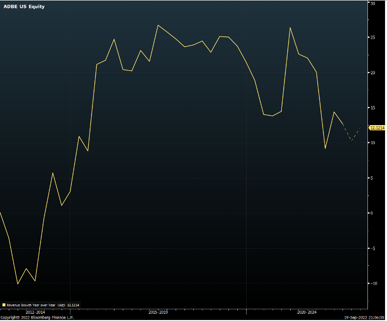
Figma’s 2022 sales, while growing quickly, will only be roughly 3% of what Adobe posts this year. Yet why was it worth it in Adobe’s eyes to give up almost 10% of its market capitalization for a company a fraction of its size? Figma’s design tools weren’t nearly the caliber, power, or quality of Adobes.
But what Figma had developed was a new dimension to compete upon: while the depth and breadth of its design tools could not stand up to Adobe’s the company had mastered other technologies that allow for real-time collaboration between multiple individuals on a project. Second, and more importantly, it evolved from being a collaboration tool for designers to a full-fledged platform that invited investment into a growing and dynamic environment. This investment could propel its tools to a point of being good enough. With its collaboration advantages giving it a leg up over everyone else already, a good enough tool set would differentiate Figma enough that it could be the primary toolset for customers if collaboration, efficiency, and productivity become the top priorities.
The company had hit its asymptote within the design community but its careful nurturing of its platform and ecosystem is what gave it its next leg of growth and its future. The company had made a bet that designers and graphics engineers would have a different set of priorities than in generations past. And now, Adobe is putting $20 billion on that same bet.
Kevin Kwok of Greylock (one of Figma’s VCs) has more on Figma, Adobe and overcoming invisible asymptotes here and here.
3. QT Hysteria
Every once in a while, you may make the mistake of turning on cable financial programming when the Fed is the topic du jour. The next time talking heads are able to comment on the Fed sensibly and without histrionics will be the first time for me. Lately, the drama has been over why the Federal Reserve’s balance sheet hasn’t been shrinking as promised. The balance sheet is largely flat since this spring despite the promise of nearly $50 billion in reductions for the first three months and moving up to nearly $80 billion per month starting this month.
Figure 4: The Fed’s Balance Sheet Is Largely Flat
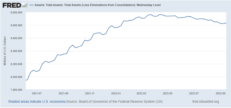
Commentators tend to shoot first and ask questions later when it comes to the Fed and its balance sheet. In the case of the above phenomenon, some basic accounting has slipped their mind.
First, among the securities held by the central bank are Treasury Inflation Protected Securities (TIPS). TIPS, as many people know, protect the holder of the securities from inflation by adjusting the level of principal (the face value of the bond) in accordance with the price level. Thus, when inflation rises, the face value of the bond does as well. In 2022 alone, the value of the Fed’s TIPS portfolio has risen thanks to those principal adjustments by roughly $30 billion.
Second, the nature of mortgage-backed securities is that their payments are part principal and part interest. And the stated methodology of reducing the balance sheet is letting principal payments roll off, not outright selling of securities. This impacts how quickly this segment of the portfolio can decline. Further, these securities operate on a significant lag, usually between two and three months. The balance sheet in June and July, therefore, represents activity from a quarter prior.
Adjusting for these simple fundamentals will show that actually, the balance sheet reduction has occurred exactly as promised. The math is available for those so inclined here.
4. The Bond Market Ballgame
“What inning are we in for the 10 year?” “How much further can rates really rise?” It’s a fair question and one that starting to get asked a bit more now that more investors are taking the Fed’s determination to quell inflation seriously. One way to view it is below.
Figure 5: Fed Funds Minus the 10-Year Yield

The two-year yield may be the best economist the market has to offer. It’s probably the best gauge of where Fed Funds will be in the near term. When it rolls over, it’s a sign that recession is very near, and shortly thereafter rate cuts. But with the market only post-Jackson Hole beginning to understand the Fed’s Prisoner’s Dilemma most eyes are on the Fed Fund’s market and how high those rates can go. Market expectations have added an additional 50bps in tightening over the last three meetings of this year, a not insignificant amount given the short amount of time. It would put Fed Funds over 4% for the first time post-GFC.
What’s interesting about Figure 5 is that coming out of every single recession in the last 50 years the spread between Fed Funds and the 10 year was higher than today’s level, and much higher at that. Given that the curve will eventually exit its inverted state and the current pricing for further rate increases, it’s not difficult to come up with a scenario of the 10-year reaching a level of the mid 5% to low 6% range. That puts the move this year in long-term rates as squarely in the “middle innings” in baseball parlance.
That assumes, though, that a correction to more historic norms between the very shortest end of the rate curve and the longer end all comes from the latter moving. The long-end doesn’t have to move. 10-year breakeven inflation rates have done nothing but fall since their May peak. 10-year yields however are flat since then, meaning investors are getting more than compensation for long run inflation risks in the benchmark bond.
Figure 6: 10 Year Rates (Blue) vs Breakevens (White)
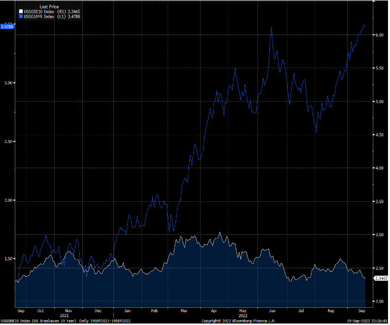
It’s fair to wonder that if investors are pricing market instruments with a lesser fear of inflation and offering risk-free rates at recent highs, if that could entice capital to come in and we see another rally in rates like we did this spring when recession fears first gripped the market. Will that be a sign that a recession is imminent or a digestion before another leg higher?