
The Wooden Nickel is a collection of roughly a handful of recent topics that have caught our attention. Here you’ll find current, open-ended thoughts. We wish to use this piece as a way to think out loud in public rather than formal proclamations or projections.
- A Recession Scorecard
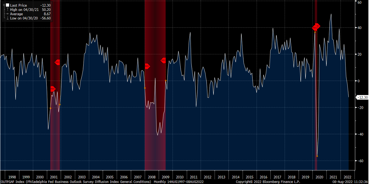
Since late June when we pointed out the strange juxtaposition between rising expectations of an imminent recession and market performance the predicament has only gotten murkier. Surveys of current business conditions from regional Federal Reserve banks (Philadelphia Fed example in Figure 1) have been abysmal across the country. Jobless claims have started moving higher while layoffs are appearing at everyone from Walmart to Microsoft and Apple. The month of June saw the greatest deceleration of home price growth on record according to Black Knight, worse than the housing crisis of 2006-2008.
Figure 1: Philadelphia Federal Reserve Business Outlook (with Recession Bars)
Then of course we got Q2 GDP reported and, like the prior quarter, saw more economic contraction. While in most economies two consecutive quarters of negative GDP growth qualifies as a recession, the U.S. is a bit different. There is a good deal of noise in the two most recent reports that some prognosticators point to (inventories and the trade balance namely) as sending a false signal about the state of the economy.
But quite frankly the debate over a present-day recession can be pushed out a little bit for two reasons. First, there’s more than one way to measure the health and size of the economy. Notably, Gross Domestic Income has not declined so far this year (data is only available through Q1), even when adjusting for inflation. This historically falls along with GDP in a recession (Figure 2). Income growth has remained relatively steady month to month even through the first half of this year.
Figure 2: Gross Domestic Income Has Not Declined So Far

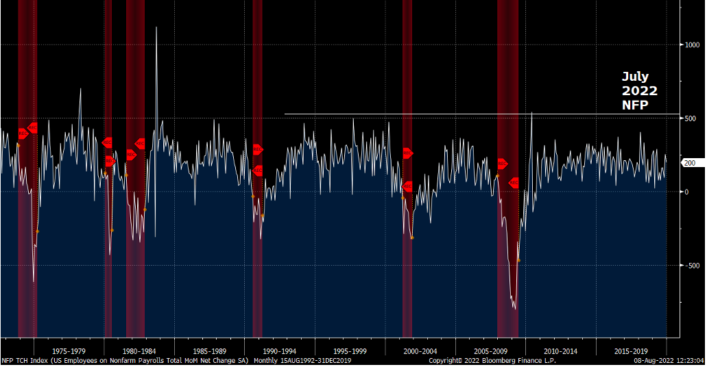
Finally, the strength of the labor market cannot be ignored. While it may pose some other issues on the economy the number of jobs being added in the current economy fly in the face of recession fears. Take the recent July report (though prior months have also been very strong). 528,000 jobs added is strong regardless of economic climate. Companies don’t have demand for labor if there isn’t in turn demand for their own goods and services. Figure 3 lists each month’s of jobs added since the early 70s through 2019 with an annotation for the July figure. Not only is 528,000 jobs nowhere consistent with recessionary environments, it would surpass some of the best jobs reports in economic history, even those coming out of recessions when labor is plentiful.
Figure 3: The July Jobs Report Was Historically Strong
The story may change as soon as Q3 but for now, the recession talk needs to be paused.
2. Peak is the Wrong Question
Much of the current obsession with inflation levels for onlookers asks whether the latest or next report will show rising prices as peaking.

Whether inflation becomes a problem of the past, through a soft land or hard landing, investors and strategists are uniform in their belief that we’re headed back to the world we had where the equilibrium level of inflation was around 2% as measured by CPI.
Figure 4: Straight Back to Normal, Source: Jim Bianco
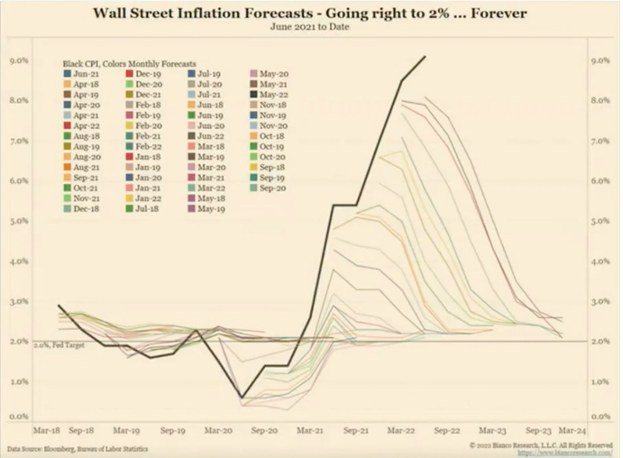
Asset classes have centered around the idea of targeting a 2% level of inflation for quite a while and were largely accurate in pricing both risky and risk-free assets for such a climate. But getting past the peak in this current cycle doesn’t guarantee a return to that world. Those are two different milestones, and they are independent of each other with their own idiosyncrasies. It’s the latter that has greater ramifications for asset markets. Namely, it is of far greater consequence to asset markets if the future equilibrium of inflation is something more along the lines of 3% or higher than if the peak happens to be 8% or 9% CPI. A greater repricing will need to occur across asset markets to recalibrate to a newer equilibrium.
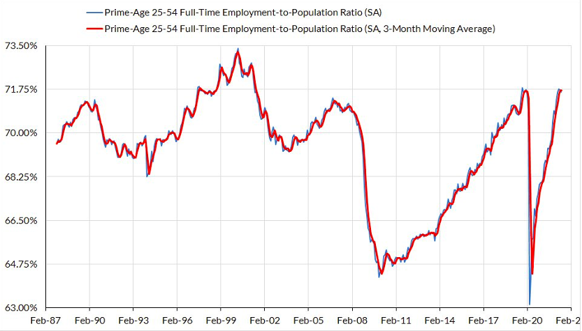
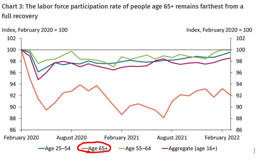
Futures markets have extrapolated the second quarter’s commodity selloff and slower economic data amidst monetary tightening to project rate cuts in the middle of next year. These projections seem divorced from the present economic reality and underlying structural rigidities getting in the way of returning to the 2% world. Namely, the labor force in general looks like it has peaked and prime workers are getting harder and harder to find. The lack of supply of workers is due mostly to early retirements of baby boomers.
Figure 5: Prime Work Age Workers Are Historically Tight and Early Retirements Have Tightened the Market for Labor
The impact on wages is obvious (Figure 6).
Figure 6: Wages Are Not Slowing

When you consider that services make up more than half of the CPIs components it’s easy to see a way for wage pressures to recalibrate overall pricing pressures a step higher than we saw in the decade prior to the pandemic. It’s no wonder then that “Sticky CPI” is at its highest levels, at ~5.5%, and isn’t showing signs of slowing.
Figure 7: “Sticky” CPI is at its Highest Ever

The relationship between supply and price for labor has conformed to theory and there’s no reason to believe it will change, even post the pandemic recovery or coming out of whenever the next recession is. Add in tighter immigration laws which have, foolishly, diminished the supply of knowledge workers and the picture gets even worse.
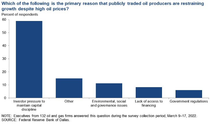
There are further structural issues contributing to higher inflation levels going forward, namely from energy/commodities as well as housing. The US economy is still years behind in anything close to a balanced housing supply and despite ample energy reserves supply growth meaningfully lags anything resembling past cycles due to the scars inflicted upon management teams from capital markets. As a result there has been meaningful underinvestment in the space and even if management teams turned open the spigots we wouldn’t see increased supply for more than a year.
Figure 8: Oil Companies Are Slow to Add Supply
But the primary culprit going forward is and will be labor. The economy is meaningfully different from the one we experienced post-GFC. Even if more supply comes it will do so at higher wages and the largest block of labor, millennials – who held back on household formation for years – is now deeper into their prime working years and starting families. With that comes the expectations of higher wages as well.
3. Credit Growth
It may have been more fitting to place Figure 9 in the first section with regards to the present recession debate but this will do as well.
Figure 9: The Fastest Credit Growth in Over a Decade
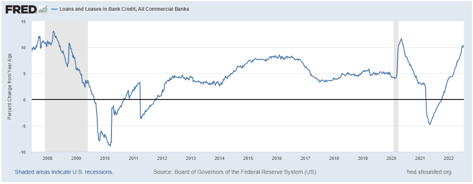
One of the most underreported economic metrics is credit growth. The current pace opened my eyes. If you exclude the short-term distortions caused by stimulus efforts in the thick of the Covid pandemic the current pace of credit growth in the economy is far and away the fastest we’ve seen since the financial crisis.
Despite the blistering economic growth we got in 2021 and financial conditions that have done nothing but tighten since the beginning of the year, consumer headwinds, and geopolitical concerns the current pace of loan growth in the economy is the best we’ve seen in over a decade. It’s a story that has been completely neglected. Through July, $600B worth of new loans has been issued, per Matthew Klein, which works out to a 12% annualized rate. That pace hasn’t been seen since before the Financial Crisis.
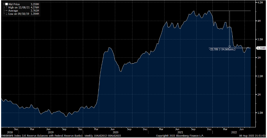
And all this happened while reserves held by banks at the Federal Reserve have dropped almost 25% year to date. So much for banks needing reserves to loan them out.
Figure 10: Reserves are Down Almost 25% YTD
4. A Bottom in Bonds Does Not Equal A Top in Yields
The 1994 analog has gotten a fair amount of press due to some (but far from all) parallels with the current economic climate. It’s also probably the closest thing the Fed has ever gotten to executing a soft-landing. It’s an interesting period of economic history for many reasons. To isolate one aspect of it that may be relevant from here on is the path of fixed income returns.
There were multiple points in the 1994 tightening cycle in which commentary and policy from the Fed got incrementally tighter with time, often to the market’s surprise. One of those actions included a surprise 75bp hike in November of 1994 after taking a pause for a couple of meetings, confident that prior hikes in the summer would do the job. After the November surprise, the Fed tightened again with a 50bp rate increase in February of 1995 and didn’t tighten again for years as inflation was firmly buckled.
Yet the fascinating thing about that cycle is that from a total return perspective the fixed income markets bottomed just two months after the first rate hike and only 75bps into the tightening cycle. The Fed would hike rates an additional 225bps over the coming 10 months and yet those hikes didn’t dent a bond investor’s returns.
Figure 11: Bonds Always Bottom Before Rates Peak, Source: Cameron Crise

Returns for fixed income investors always bottom before yields reach a peak thanks to the help of coupon income. But the amount of time in between the bottom in returns and peak in yields in this historical case was quite surprising.
In the present cycle, rates have been too low to rely on that as a cushion against incremental rate volatility. But at the present moment one has to wonder if now, or sometime in the near future, a similar scenario will present itself and allow for greater diversification of return sources in portfolios.