
The Wooden Nickel is a collection of roughly a handful of recent topics that have caught our attention. Here you’ll find current, open-ended thoughts. We wish to use this piece as a way to think out loud in public rather than formal proclamations or projections.
1. Consumer Debt and Big Scary Number Syndrome
Financial media, and media in general, often like to make headlines and news by stripping context and nuance away from topics. Credit card debt specifically, and consumer debt in general, is one of the most recent examples. Headlines like this use the word “record” in referring to current consumer credit card balances, and the implication is that because this particular indicator has hit a new high, consumer balance sheets must be stretched beyond practical limits and a crash is imminent.But like most indicators, using ratios provides a bit of helpful context. After all, if incomes rise, it’s natural for debt levels to rise as well. If they rise together and stay at reasonable levels, nothing calamitous should be imminent. It is imbalances that concern us more than arbitrary levels. Alas, credit card debt since 2019 has risen far less than the total economy, household net worth, and home equity levels measured through June 2023.
Figure 1: Credit Card Debt Has Lagged Growth in the Economy, Source: Ben Carlson

Consumer debt in total is also nowhere near levels of historic excess either. While it has risen lately, credit card debt has still lagged the growth in Personal Disposable Income since the onset of the Covid Recession and overall Consumer debt levels as a percentage of disposable income are still roughly 25% below anything near pre-GFC levels.
Figure 2: Consumer Debt as a Portion of Disposable Income is Not Excessive, Source: 22V

Finally, and perhaps most conclusively, consumers’ capacity to bear debt levels from credit cards and other forms of debt has perhaps never been higher. That is because, usually, the largest item on a household’s balance sheet is the mortgage. But with record low rates, consumers took advantage and locked in mortgages well below 4%, a historically healthy level. Mortgage debt is essentially at its lowest level in decades. Thus, incremental consumer debt in the form of card balances is unlikely to dwarf the massive savings consumers experienced by refinancing mortgages at record-low rates. That is why, despite a spike in credit card rates and debt rates in general, delinquencies remain so low. Even the continuation of student loan debt is unlikely to undo the tailwind from mortgage debt savings.
Figure 3: Record Low Mortgage Debt Increases Consumer Balance Sheet Capacity, Source: 22V

Figure 4: Cred Card Delinquencies Near Historic Lows, Source: 22V

2. When ROIC Lies
ROIC (return on invested capital) and its benefits have been touted plenty on this website. And it remains, conceptually moreso than literally, a key driver of business and security analysis. But like any other metric, when stripped of meaning and fundamentals it can trick an unsuspecting investor or analyst.
Early on in a peer’s career as a portfolio manager, they were examining two stocks, listed below. Both stocks were members of the S&P 500 and both operated in the same sector of the economy. In fact, they were direct competitors in the household products space. The manager was new to the space and had been referred by a colleague that Stock A (in the top panel of the below chart) was the superior company. He could not understand the degree of outperformance, however, between the two names given that they play in the same parts of the economy and post similar levels of ROIC and ROC.

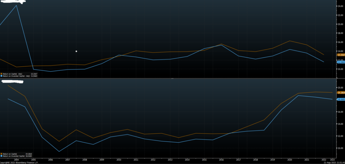
It’s one thing for market enthusiasm or a specific narrative to lift a name for a bit beyond what fundamentals warrant, but 10 years of outperformance by such a dramatic degree? Why would a stock posting acceptable, but not stellar, ROIC levels trounce the S&P 500 during one of the greatest bull runs ever? What was going on? And this is household products, not A.I.
“Think about the business model. And then look at Free Cash Flow per Share.” That was the advice his colleague relayed after the PM posed some of the above questions. And then it clicked.To jump ahead a bit, Stock A is Church & Dwight, the maker and seller of brands such as Arm & Hammer and OxiClean. Stock B is Procter & Gamble, a powerhouse in the consumer products space with brands such as Tide, Gillette, Bounty, Pampers, and many more. The two have plenty of products that compete head-to-head and sell to the same retailers. But they have very different means of going about their business.
Church & Dwight’s expertise is as much, if not moreso, in the financial acquisition of brands and household products rather than their marketing and pricing power. Their core competence is in acquiring smaller brands that they see potential in and expanding their distribution. Importantly, they prefer no manufacturing assets, willing to sacrifice margin to have outsourced production in order to free up capital. Because of this acquisition model, accounting conventions can unduly penalize the accrual metrics that hit the income statement. Further, most crude calculations of ROIC (like those found in stock screeners and even expensive subscription services) include the capitalization of certain expenses and items. The result is that the numerator in ROIC is excessively deflated while the denominator is inflated. Looking at the Free Cash Flow per Share tells the story clearly. After all, the entire purpose of ROIC is to see how much cash is available to the business to deploy or return back to shareholders.

The lesson being that if an analyst cannot connect the implications of the business model to the financial statements, he or she will, at some point, make considerable mistakes of either commission or omission.
3. Rates Make a Move
We wrote last month that the economy had seen fiscal forces move from a headwind to a tailwind in the past year and that it was a misunderstood or overlooked reason for why the economy remained resilient. Continued economic strength meant that interest expense burdens remained at their lowest point in decades. Thus, to see a real economic slow down “rates need to move higher or stay high longer.” It seems the bond market has made up its mind.
Since then, the 10-year yield has risen over 50bps and hit post-GFC highs. However, the yield move has not just been a US phenomenon as core European bond rates are at the highest levels in 10+ years and even Japan has articulated a willingness to let yields move in a greater range and move upwards.
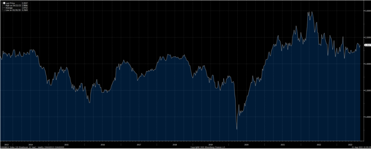
Economic strength has not been the sole reason for the move even as GDP Now from the Federal Reserve Bank of Atlanta estimates Q3 GDP to be growing at over 5.5% annualized. And inflation expectations don’t seem to be to blame either, at least not yet. Inflation breakevens (the difference between nominal and TIPS yields) for the next 10 years are largely where they’ve been for most of the past decade.
Figure 5: Inflation Breakevens are Within a Normal Range
nstead, there is a shift underway in the composition of the Treasury market that is important for investors to understand. Namely, supply is rising, especially on the long end of the Treasury curve.
Post the debt ceiling debacle, the Treasury Department has been very intentional in resuming issuance in a way that is least disruptive to markets and the banking sector. From early June, over $500B of debt was issued but the focus of these issuances was on the short end of the curve via Treasury Bills, which do not pay coupons. The goal was to attract funds out of the Reverse Repo Facility instead of the banking system by offering rates above the RRP. Mission accomplished (Figure 6). From June to mid July the Treasury General Account was replenished from near zero levels to over $500B without a disturbance to the market.
Figure 6: Issuances First Targeted the RRP, Source: Joseph Wang

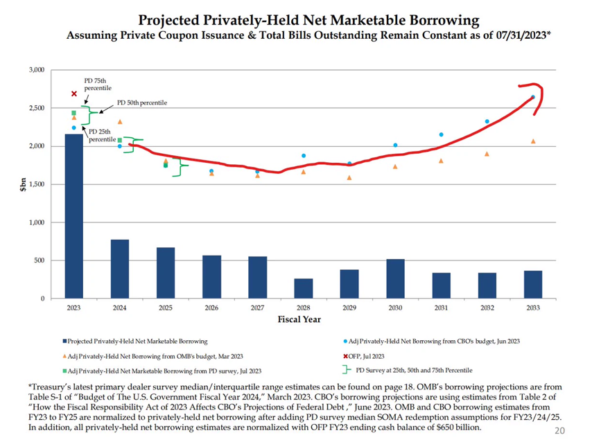
But as issuance continues and moves from refilling the TGA to financing future government expenditures, the composition of securities issued will shift from bills to coupon bonds. The latter are not eligible for money market funds which have to keep cash invested in notes that expire in less than 397 days. Thus, yields on coupon bonds compete with other non-cash-like assets for funds. While bank deposits have not been pressured as issuances prioritized Bills, the shift to coupons will start to impact liquidity but that impact is only now gathering momentum. Additional coupon supply introduces term premium into the bond market and widens risk premia in risky assets such as equities. And coupon issuance is set to be substantial for the next several years.
Figure 7: Coupon Issuance Will Be Substantial for Years, Source: Joseph Wang
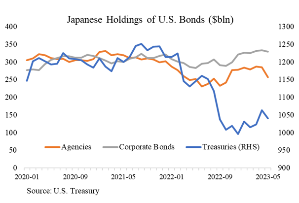
Finally, with Japan becoming incrementally tighter, additional supply comes onto the market. Holdings of US bonds by Japanese investors has declined ~$200B in just the last year (Figure 8) as domestic opportunities become a bit better.
Figure 8: Japan Steps Back, Source: Joseph Wang
4. Recommended Reads and Listens
As a deviation from past editions, please find below some recommended articles, podcasts, and other resources we found enlightening across a number of disciplines. None are endorsements of stocks or anything in particular. Rather they are informative and helped us think deeper about topics and concepts so we found them worth sharing.