
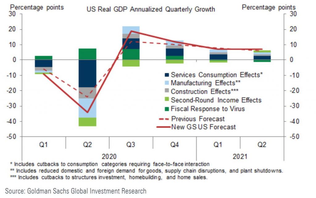
The major U.S. stock indices just closed their worst first quarter in history. And yet it’s not hard to find plenty of optimism thanks to the rally seen last week where some equity indexes rose by over 20% of their lowest point. Morgan Stanley, earlier this week, effectively declared that the bottom was in since markets and investors were now openly expecting a recession in the U.S. Goldman Sachs, while lowering their estimate of Q2 GDP, raised their estimates for the rest of the year and think everything will be back to normal as soon as the second half of 2020 (Figure 1).
Figure 1: Goldman Sachs GDP Forecasts a V-Shaped Recovery
Proclamations like this are excessively confident at best, and myopic at worst. Closing a businesses is considerably easier than opening one; firing an employee is much less consuming in time and effort than in hiring. Biological systems, like an economy, with their interrelationships, complexity, feedback and non-linearity, don’t turn on like a light switch. Equilibriums, at both their peak and troughs, represent a complex process.
Not only are forecasts like this unrealistic, but also they don’t line up with history. In the post-World War II world, the average recession lasted 11 months. The shortest, of 6 months, came in 1980, amidst a period of rolling recessions from one industry to another, and did not see the US voluntarily shutting down its economy for an indeterminate amount of time. Airlines, restaurants, and other industries are stating that the current environment is the worst they’ve ever seen, worse than 9/11 and worse than the Financial Crisis. Expecting an immediate return to normalcy after what would be the shortest recession since World War II and more extreme than anything other than the Financial Crisis is wildly optimistic.
Like many investors, these experts and prognosticators are assuming that the market turmoil is solely due to the impact of COVID-19 and that once the dangers of the virus are in the rearview, the rest of the economy can function like nothing ever happened. It’s the easy narrative and for that reason it can be alluring.
But what if there’s more to be concerned about than just COVID-19? What if the virus simply makes the most noise but the strongest signals for economic weakness were elsewhere? To use an analogy, our view is that the virus was the final push over the ledge for a wobbly economy, but there was plenty that showed we were looking over the edge before this pandemic. If we’re correct, then the trough of this recession involves the economy, businesses and global supply chains going through restructurings and reorganizations, not just looking to flip a switch back on.
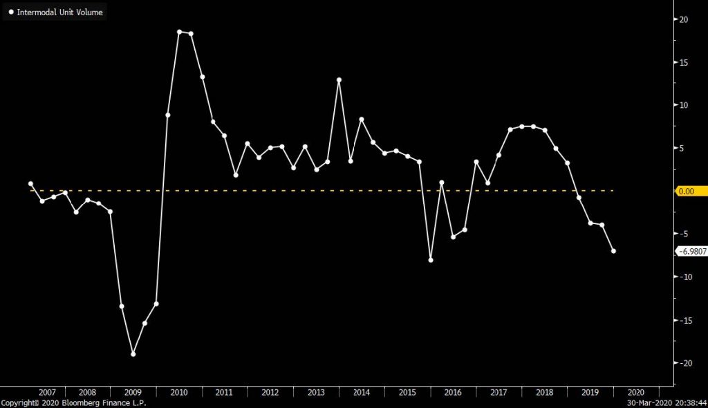
First, an indicator that Warren Buffet says would be his first, and sole, choice to judge the health of the US economy if he was stranded on an island: railcar loadings, the volume of goods transported on America’s railroad networks. The relationship between Carloadings and recessions in the U.S. (shown in red bars) is clear (Figure 2). The one exception, in 2015 and 2016, still saw negative earnings growth year over year for 7 straight quarters. Even if you ignore the portions of traffic that are volatile, like petroleum and automobiles, and focus instead strictly on volumes from intermodal containers, like consumer goods, the numbers remain very grim (Figure 3).
Figure 2: Railcar Loadings Year over Year
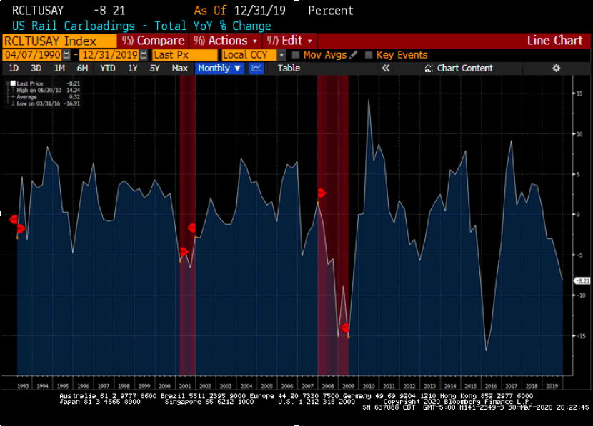
Figure 3: Intermodal Volumes YoY
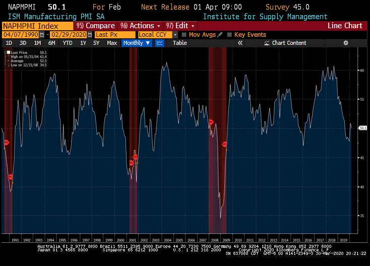
The manufacturing economy peaked in December of 2018, over a year before any of us had heard of, let alone been affected by, COVID-19. The relationship with recessions is clearly evident.
Figure 4: The ISM Index Peaked in December 2018
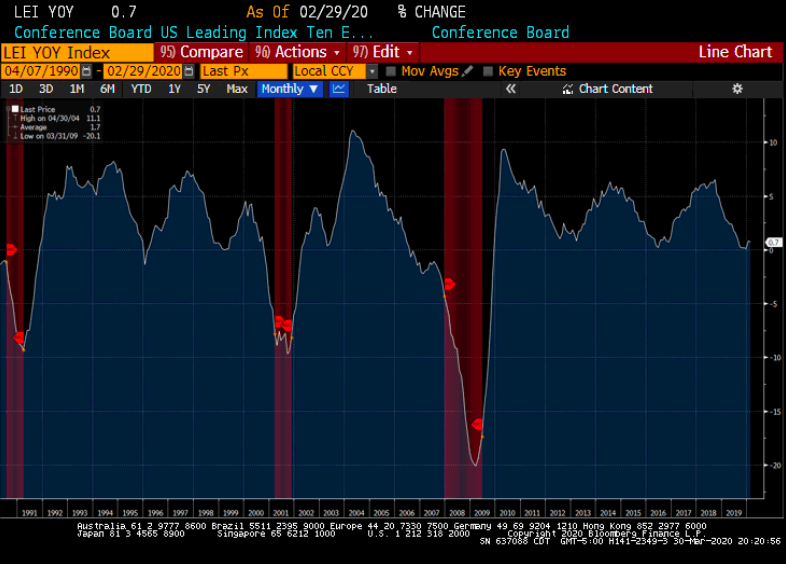
An even broader look at the economy from the Leading Economic Indicators Index confirms that a slowdown in activity has been in place for a long time.
Figure 5: Leading Economic Indicators Rolled Over in December 2018
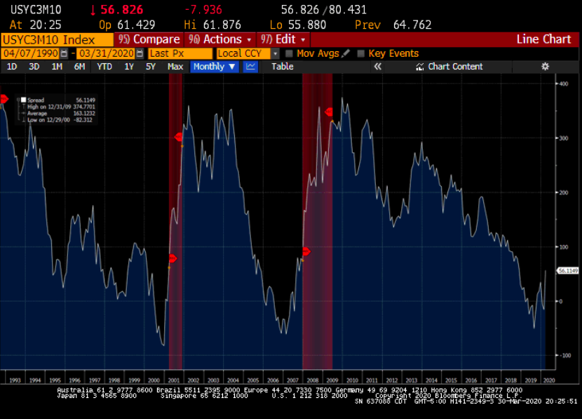
Finally, a considerable number of intra-market indicators have been warning about the market’s fragility for quite some time. Take a look at the yield curve, shown below as the rate on 3month US paper against 10 year yields. When investors have greater confidence in the 10 year picture than they do the time in front of them, it’s been a consistent warning sign throughout history. Every recession has been preceded by a yield curve inversion, 12-18 months out, when that inversion is sustained beyond just a brief moment. The curve went negative in the spring of 2019 and stayed there for months.
Figure 6: The Yield Curve Inverted for a Sustained Period Last Spring
This year started with plenty of optimism. Markets made new highs in January and February. Trade tensions were easing. And monetary policy was not going to be a headwind any time soon. But underneath the surface, what looked like strength was fragile. Oil prices were collapsing despite geopolitical tension and enthusiasm for a global economic acceleration. Bonds yields were signaling something closer to disinflation, if not outright deflation, instead of a coming demand wave that would raise prices. And within the stock market, strength was concentrated: small-cap stocks weren’t behaving like broad economic growth was underway, the Dow Transportation Index failed to join the broader market in making new highs, the list of stocks making their 52 week lows was growing, and gold was outperforming the stock market.
Figure 7: The Market’s Strength Wasn’t Confirmed Elsewhere
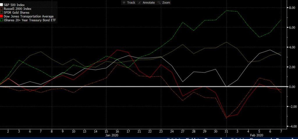
If things were so good, if economic growth was set to quicken, shouldn’t the enthusiasm extend to broad parts of the market? Shouldn’t the smallest of companies be the first to benefit? Shouldn’t transportation companies, with their high ratio of fixed expenses, be buoyed by any increase in demand? Shouldn’t fear recede in good times and push people to drop risk-free assets? Then why the divergence between the major indices and a broad swath of market indicators?
Every so often these questions arise the markets. The result, more times than not, spells a market primed for a dramatic selloff: 2001, 2007, 2015, 2018 and now 2020 all saw these ingredients in place at the same time.
The economy was fragile heading into 2020. COVID-19 may get the majority of the blame, much like housing did in 2008, but there was more going on. The virus is not the whole story and certainly not the cause of decelerating trends seen in the indicators above since 2018.
So what do we prescribe the strength of the last week or so? Again, let’s look at history. In 2007 the S&P 500 entered a bear market, and would fall about 50% around a year later but between Thanksgiving in 2008 and New Year’s the market rallied over 25%. For context, a 25% return in any year would be among the very best since the dot-com bubble, and the 13th best since the creation of the index in 1927. But from New Year’s until its March bottom the S&P fell another 27%.
Figure 8: Market Bottoms are a Process a la 2008
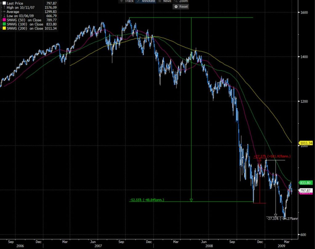
This same pattern happens over and over again. The bear markets of 2001, 1990, 1981, 1973, 1966, 1961, 1956 all possessed this same form of a massive rally within turmoil. But just like the economy, the bottoming of asset markets is a process, not a singular event. Periods like the fourth quarter of 2018 are the exception, not the norm. Exceptions are always possible, and the market doesn’t owe us any particular result, let alone the path to it but investors would be wise to know what’s probable and the historical precedent.
You may recall our commentary of February 6th, where – about two weeks after we notified our clients that we are becoming nervous about the market – we explained some of the technical reasons that made us believe that a correction was forthcoming.