The storm we have been writing about in the last three weeks seems to be gaining speed. The Greek debt crisis can open Pandora’s box and unleash sovereign debt, banking, bond, and equities turmoil, generating the third phase of the crisis we wrote before (see e.g. the April 8, 2011 commentary), which could become the most serious in the last 70+ years (commentaries on May 29 and June 3, 2011).
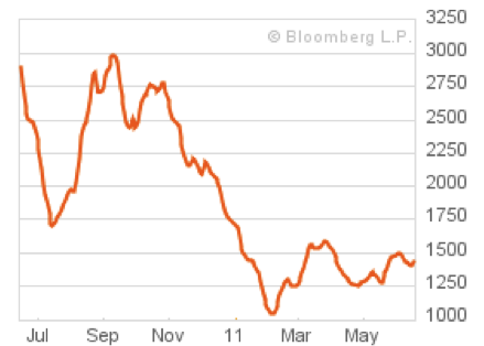
The economic slowdown is also portrayed in the Baltic Freight Dry Index (BDI), as the following graph shows.
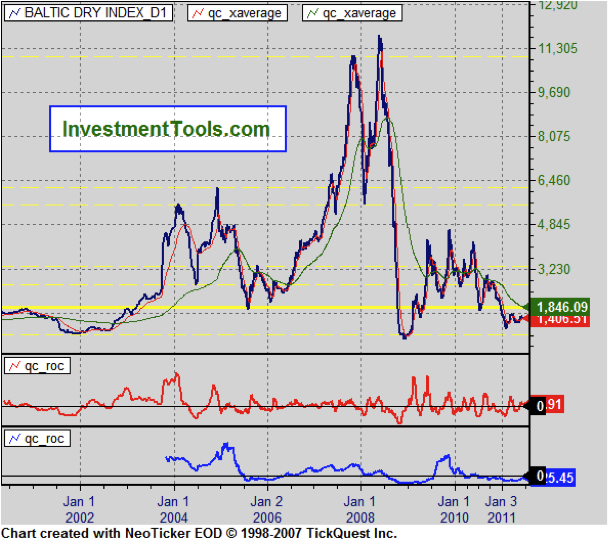
However, we believe that the index needs to be viewed over time by itself, and in relation to an anchor. The following graph shows the index over the course of the last 10 years. Recently it has reached the 2002, and 2009 low recessionary levels. The index is shown along with its 20 (red line) and 200 days (green line) moving averages. If the index falls below its 10 year minimal levels, we would have a clear indication that we are headed towards very troubled waters.
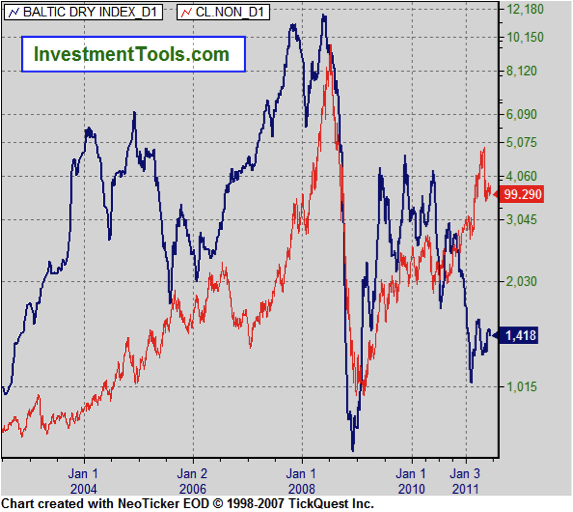
We will use two anchors in relation to the BDI index. The first one is oil prices (red line below). The graph below shows a clear co-movement between the two prices. The co-movement held well over the course of the last several years. However, the relationship seems to have broken down in the early part of this year, something that could be explained if we take into account the dichotomy between the real economy represented by the shipping index (blue line), and the financial economy where oil assets are used for collateralization purposes to support credit creation.
The formation of the storm could burst the collateralization process, and hence reduce the value of the oil prices. If we are headed for a major bust, any Greek-generated credit event will be the excuse-symptom that will start the financial tsunami.
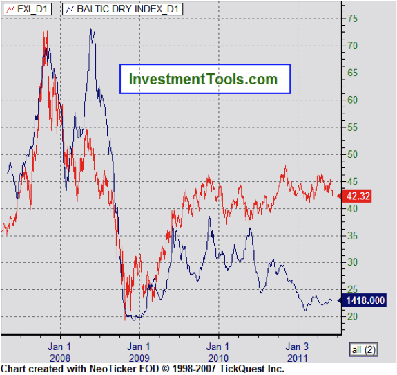
The index also has exhibited a close co-movement with the performance of the Chinese market, given that the latter is the source of exports. The graph below shows that close relationship. This relationship also seems to have broken down lately. This can be explained by the extraordinary measures that the Chinese authorities have taken to boost their economy and consequently their markets. The BDI however, cannot be manipulated by monetary tricks and camouflages of credit creation, and thus remained down.
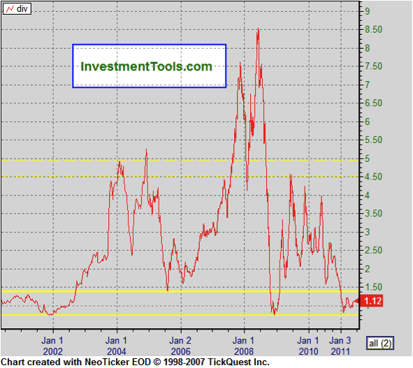
Now, when we divide the S&P 500 by the BDI index, we confirm the bottom we mentioned before (see figure below). Having reached this bottom and given the signs of the gathering storm, if it falls even further, the game in town will be higher volatility, and greater risks for the global financial system.
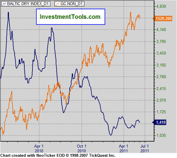
The second anchor we would like to use is the price of gold. As the following figure shows the divergence between the two prices, point to the rising uncertainty in the midst of a fragile recovery that is only based on financial measures and not on ones that touch the real production and employment levels in the global economy.
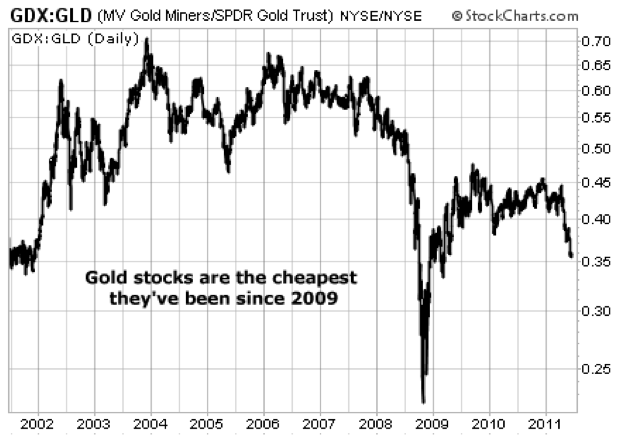
The divergence observed above makes us wonder if – given the expected greater uncertainty – investing in recently non-loved gold miners and gold stocks (who have underperformed relative to gold prices) might be a prudent move. The graph below shows the ratio between gold stocks and the price of gold. A low point may show a potential entry point.
Should we shout “Ode to hard assets?”

