Debunking Investment Myths
Debunking Investment Myths
-
Author : The BlackSummit Team
Date : July 14, 2020
Alex Bavelas was a 20th century psychosociologist whose research was primarily focused on how information traveled and gained acceptance in small networks. After graduating from MIT, he moved to Stanford University to teach and while there conducted one of the most fascinating experiments in human psychology and decision making.
Bavelas placed two subjects, Smith and Jones, in separate rooms with their own projection screen and unable to communicate with each other. They are told that they must learn to distinguish healthy cells from sick ones solely through trial and error. In front of each person is a button marked Healthy and Sick along with lights that illuminate if their selection is right or wrong. Each time a slide is projected each subject is to guess if the cell shown is healthy or sick by pressing the respective button, after which they receive feedback on if they were correct.
There is a catch however. Smith gets true feedback; if he’s correct, the light in front of him tells him so. After enough trials, Smith starts to get around 80% of his guesses correct.
Jones, unbeknownst to him, gets entirely different feedback. Rather than being told if he’s right or wrong based on what button he pushes, the feedback he gets is solely based on Smith’s guesses. If Smith guesses correctly, Jones is told he’s correct, regardless of what button he pushed.
After a round of guessing, the moderator brings Smith and Jones together to discuss the processes each used judge healthy versus sick cells. Smith offers simple, concise and concrete rules to explain how he came to his guesses. Jones on the other hand offered a process that was complex, intricate, multi-variate and abstract.
Before the next test each is asked to predict who will do better and both says Jones will. Smith in fact is blown away by Jones’ “brilliance” and decides to change his approach, adopting some of Jones’ principles.
His next score was substantially worse.
The only thing that may be more profound than the devotion the human species has for complex explanations and narratives (seeing them as inherently superior) is their arrogance for holding onto them rather than recognizing the variability and randomness of the world. We cling to narratives, especially when they align with our ideological prerogatives, regardless of whether or not there are alternative, more plausible explanations. Nowhere is this phenomenon more pronounced than in financial markets.
Given the enormous divergence between macroeconomic data and asset markets that has surprised many (including yours truly) this post will focus on debunking a handful of commonly cited beliefs in the worlds of investing and finance that may not stand up to scrutiny or at least suggest that causality is more nuanced or unknowable than we’d care to admit.
Some examples will cite counter explanations. Some will not. Some myths are common misunderstandings. Some are preposterous claims.
The purpose of this write up is less to explain everything and more as an exercise in appreciating randomness, alternative explanations, and not taking everything at face value.
Myth 1: Federal Reserve asset purchases will cause the money supply to explode and lead to hyperinflation
A fun anecdote courtesy of Mark Dow, a former economist with the IMF. From 1981 through 2006 credit market assets held by US banks grew by $32.3 trillion or 744%.
Ask yourself: what was the corresponding increase of reserves held at the Fed over that time period?
Answer: they fell by $6.5 billion.
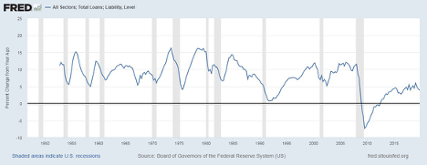
Causality between base money and the money supply is not direct; an increase in the former does not have to lead to an increase in the latter. Consider the fact that we’ve witnessed extraordinary programs instituted by the Federal Reserve both in terms of scope and size. And yet, loan growth is by far weaker this cycle than it has been in past cycles. In fact, the peak in annual loan growth post the Financial Crisis is roughly equivalent to the levels of loan growth seen in past recessions! For instance, in the 2001 recession loan growth fell from over 10% to 5% at the nadir, just like at the bottom of many other past recessions. Yet those trough levels became the peak over the past decade.
Figure 1: Total Loan Growth Has Been Historically Weak, Irrespective of the Fed
It’s tough, if not impossible, to get excessive inflation without correspondingly high levels of loan growth, the latter frequently occurring with credit excesses.
And yet, historically, there is zero relationship between the growth in central bank base money and corresponding levels of inflation
Figure 2: No Relationship Between Central Bank Reserves and Inflation (Source: Peter Stella)
Maybe, just maybe, something else matters when it comes to explaining how loans originate and how inflation manifests in the macroeconomy.
Myth 2: Stocks have only risen because of QE and the Fed’s Balance Sheet
It’s not difficult to find some variation of the above statement. It’s been cried aloud for the better part of a decade because people didn’t understand how banking and the money supply works. They of course devolved to inventing narratives that were incongruent to reality and didn’t hold up to scrutiny.
Consider the following two counters:
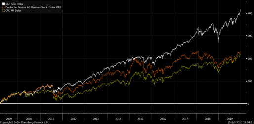
From 2009 until that first post-GFC rate hike the S&P 500 increased at a rate of 15.3%, surpassing the historical average of around 9% per year. The balance sheet grew continuously for years as the economy came out of the GFC until it peaked in the second half of 2015. In fact, the Fed began raising interest rates in December of that year and continued doing so until the summer of 2019.
In that period the balance sheet shrank by about 25% and the Fed Funds rate was raised from zero to 2.5%. Yet the S&P 500 rose over 50% for a compounded annual growth rate of 14.15%, also well above the 9% the market has historically returned. For all the cries about the markets’ “dependency” on the Fed and liquidity it had no problem providing historic returns in the midst of a shrinking balance sheet and tighter monetary policy.
So despite a doubling of the Federal Reserve’s balance sheet, interest rates taken all the way to zero, forward guidance, Operate Twist, and the excess capacity left over from the greatest financial crisis in nearly 100 years during this “pre-tightening period” all we got was an additional 1% in performance? I must ask, is all the pervasive noise worth the energy and attention?
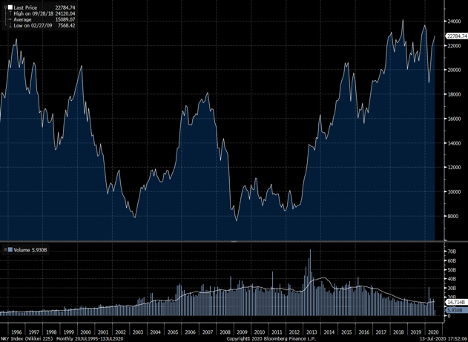
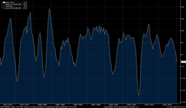
Second, and more importantly, if QE and balance sheet expansion is so good for stocks what should we take away from the Japanese and European markets? Both have substantially enlarged their balance sheets and yet their markets’ performance is nothing like the U.S. The Nikkei has gone nowhere for 25 years even while this coming March will mark 20 years of QE (Figure 1). If QE was such an accelerant for stocks why doesn’t this show up around the globe?
Figure 3: The Nikkei Has Been Flat for 20 Years Despite QE
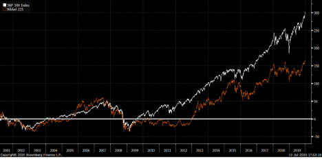
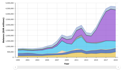
The narrative falls apart even more in the case of the ECB considering that the timelines of central bank policy are much closer than the Japanese case and the fact that the balance sheet expansion was similar in size (in percentage terms). And yet, the German and French markets trailed the S&P by 5% per year (Figure 2).
Figure 4: The ECB also Doubled Its Balance Sheet but Asset Market Performance Also Trailed
Maybe, just maybe, QE is irrelevant as both an economic policy tool and as a catalyst in asset markets. Maybe focusing on the noise is a waste of time.
Myth #3: The US suffers from chronic underinvestment
Some form or another from this line of thinking has been bandied about for several years. They point to charts like the ones in Figure 5 and say that inadequate investment levels have caused low economic growth since the GFC. Notice how sporadic levels of Gross Private Investment above 5% have been over the last decade or so, only crossing that common historic threshold for brief moments of time.
Figure 5: Gross Private Investment Has Trailed Past Cycles
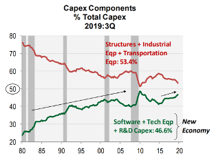
But this perspective fails to account for the underlying changes in the structure of the economy. As famed value investor Bill Nygren has observed, in 1975 over 80% of stock market value was tied to tangible assets. As of 2018, 80% of stock market value is now connected to intangible assets. The former has a different investment profile than the latter (Figure 6).
Figure 6: Intangible Investments Have Made Up for CapEx
This phenomenon also explains why “Value” as an investment factor has trailed “Growth” for the better part of a decade. The former is largely tied to old notions of book value which are growingly outdated methods of valuation considering the rise of intangible assets and the increasing amounts of time and capital being spent on technology to drive the economy.
Myth #4: The Decline in the USD’s Purchasing Power Implies A Lower Standard of Living
Fear mongering charts like the one below (Figure 7) are frequently trumpeted by charlatans as a sign of the worthlessness of the dollar or some other doom and gloom scenario.
Figure 7: Stupidity in a Chart
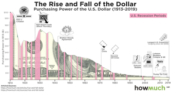
The chart and the argument it makes is completely spurious and irrelevant. It completely ignores the path of wages and salaries of workers. Imagine if your dollar this year affords you 1 gallon of milk but that next year your dollar only affords you a half-gallon of milk. If your salary has doubled, has your standard of living been impaired? Not at all.
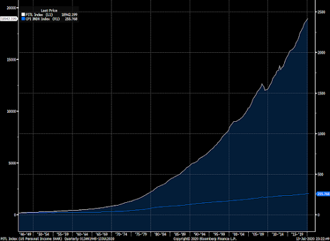
Personal Income and GDP per capita have both handily outperformed any erosion in purchasing power brought upon by inflation.
Figure 8: Personal Income (White) Has Easily Outpaced Inflation/CPI (Blue)
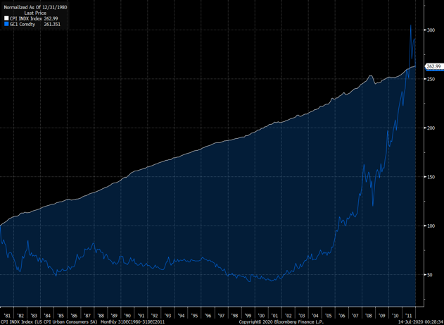
Myth #5: Gold Hedges Against Inflation
The true answer is sometimes it does and sometimes it does not.
The worst period of inflation in the United States started in 1966, when core CPI began rising over 3% in an aggressive manner, reaching as high as 14% in the early 1980s before Paul Volcker implemented rather courageous policies to tame it. By 1985, persistently high levels of inflation were largely controlled and the CPI was back under 2%.
Gold certainly did its job over the time period, rising over 11% on a compounded annual basis, far better than almost any other asset class. But something funny happens when you compare gold’s performance to what should be the worst place to put your money in during periods of high inflation: cash.

During the worst stretch of inflation the US experienced 3-month T Bills not only surpassed inflation and protected investor purchasing power, it was a far more efficient investment than gold, trouncing the precious metal as measured by the Sharpe ratio thanks to its far lower risk. Further, even a cursory familiarity of behavioral finance would tell you that people are far more likely to stick to an investment of lower volatility than ride the waves of high unpredictability year after year for 20 years.
Things get even funnier if you move the timeline just a bit: Starting in 1975 and again going through 1985 when CPI dipped below 2% the performance looks like this:

Inflation is actually higher per year in this time period, gold’s performance is worse, its volatility is higher, and better yet it doesn’t even hedge inflation. It trails the return of cash by nearly 6% per year.
Over an even longer period of time that’s the story of gold: dubious, erratic and random performance which sometimes correlates to periods of high inflation and sometimes doesn’t. In fact, imagine if you were sitting in 1980 worried about how you’re going to fill up your car with gas after seeing crude oil rise 250% in the last two years. You may want to protect yourself from further price increases and buy some gold.
Figure 9: What Kind of Hedge Needs 30 Years to Breakeven?
Gold went on to have a stellar decade in the 2000s of course but it wasn’t due to inflation scares. After all, inflation only rose above 4% in two out of 108 months between the recession of 2001 and the GFC.
Maybe, just maybe, the price of gold is far more random than people care to admit. After all, it just sits there and consumes far more than it produces, costing storage and insurance and providing zero cash. Just the hope that there will be a greater fool out there willing to buy it at a higher price at the exact moment you need him to. No wonder it’s only produced 1% of the return of equities since World War II.
Maybe, gold’s value is more a product of psychology than anything fundamental. Or maybe, it’s something else.
*Credit to Jim O’Shaughnessy and his book What Works on Wall Street for the telling of the Bavelas experiment